The brief: to create a brand based around the given word "stereo". When discussing this word I quickly realised I didn't even understand what a stereo is, what the difference was between a mono speaker and a stereo, etc. This lack of understanding was the catalyst for my brand Human Frequency.
What I concluded from this insight was that my generation may have lost our awareness of technology and take it for granted. This idea could be applied to stereos and music listening. Unlike my parent's generation who grew up loading cassettes, vinyls or CDs and have experienced the development of technology surrounding music, my generation have always just loaded the song up on a screen and clicked play.
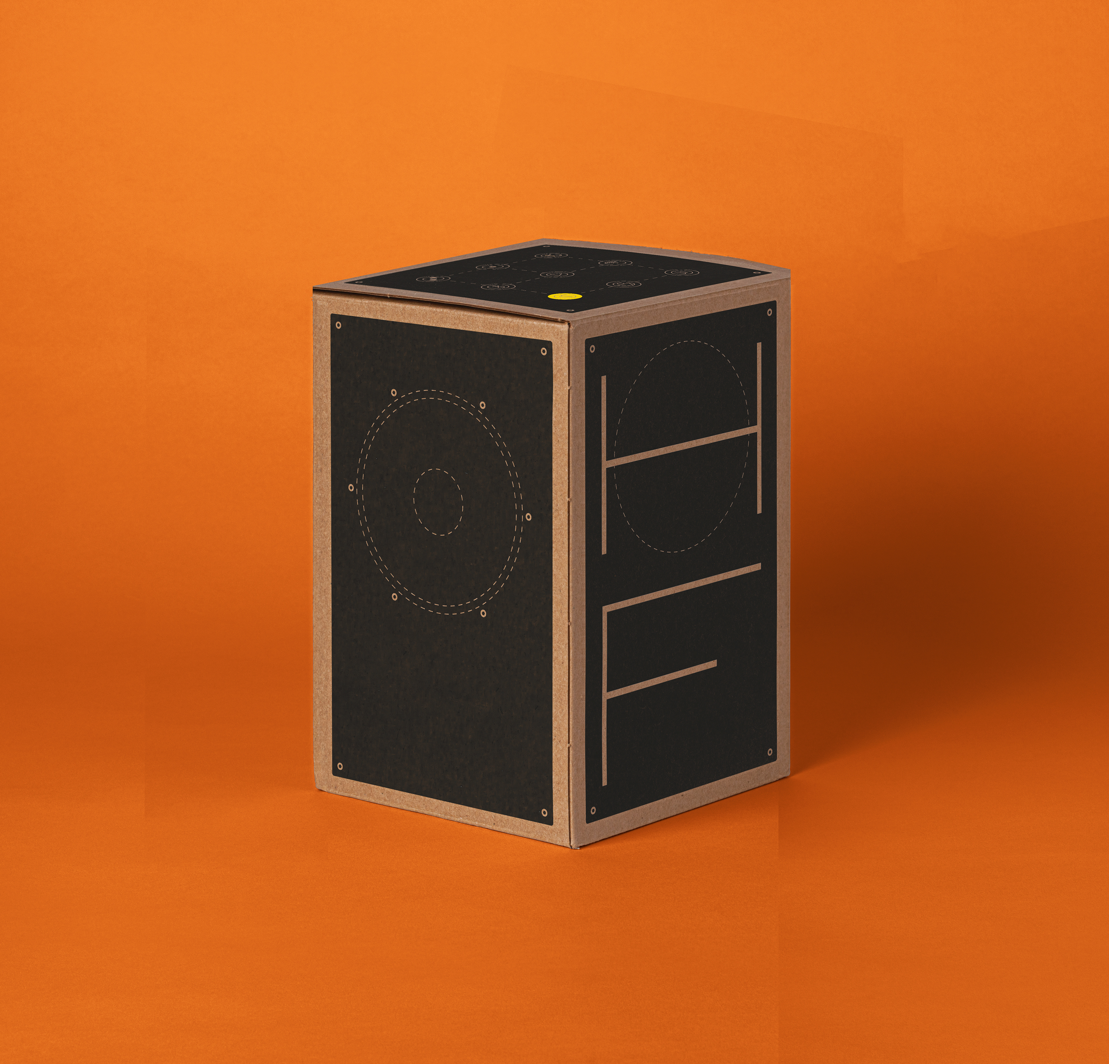
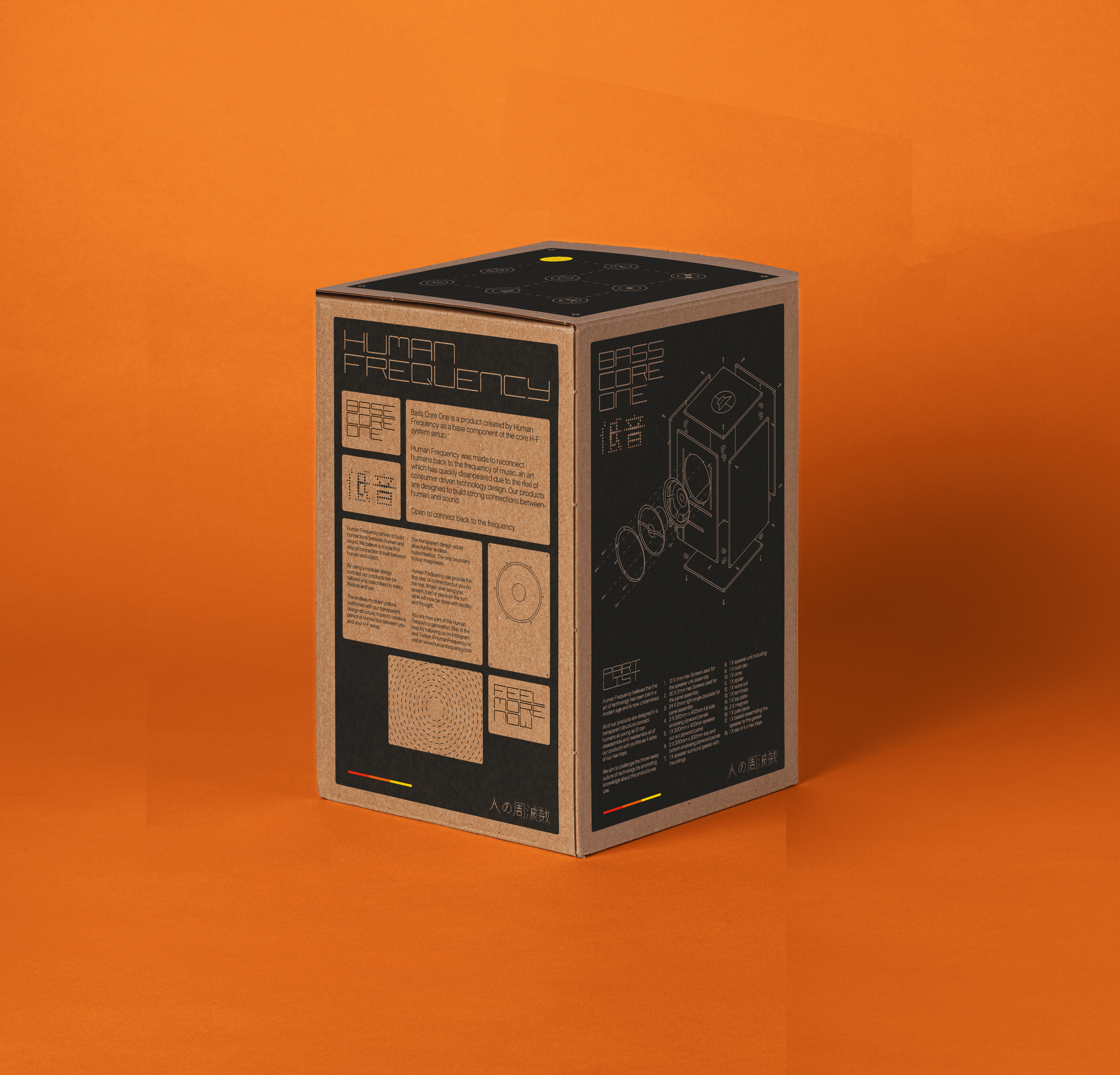
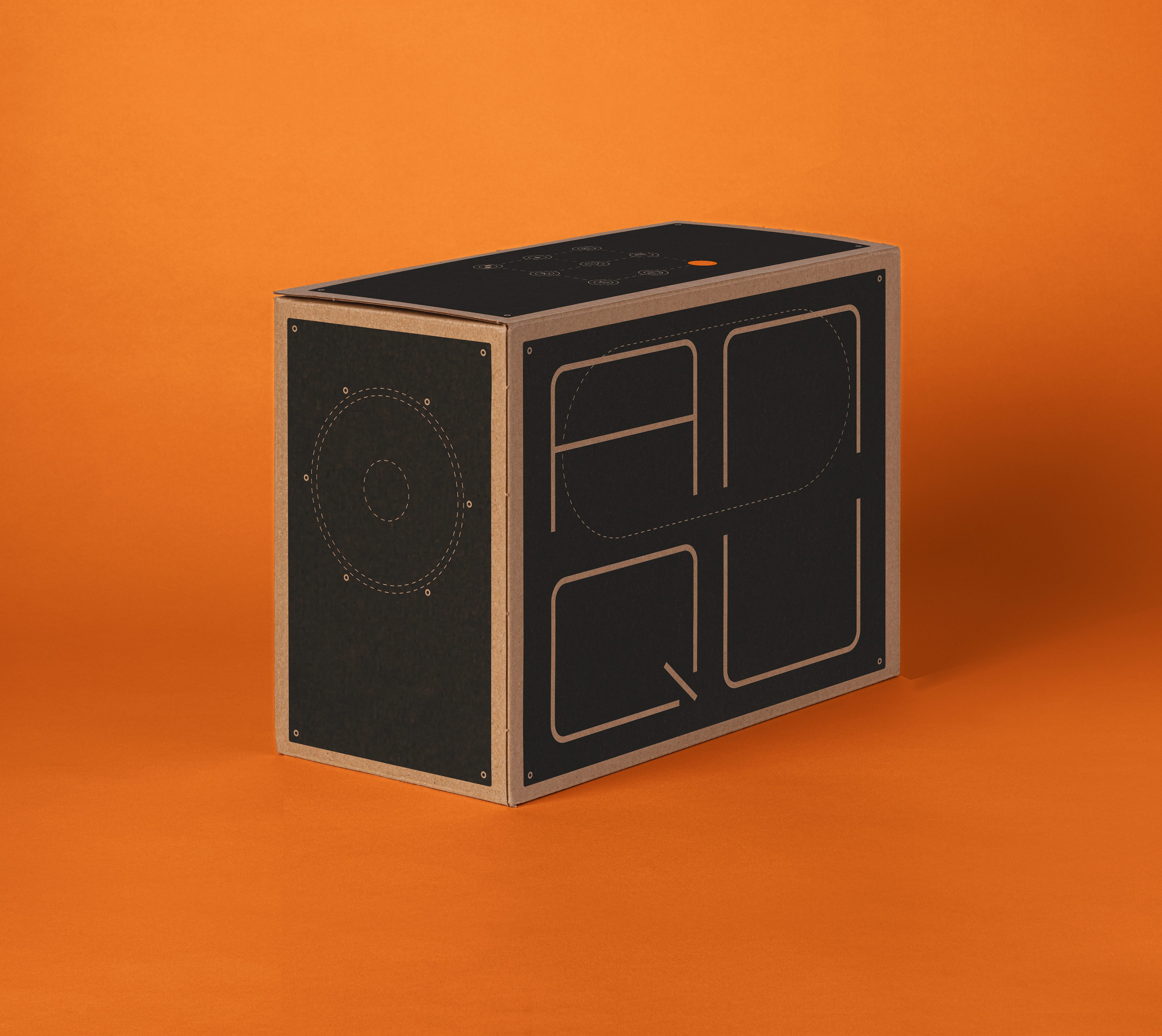
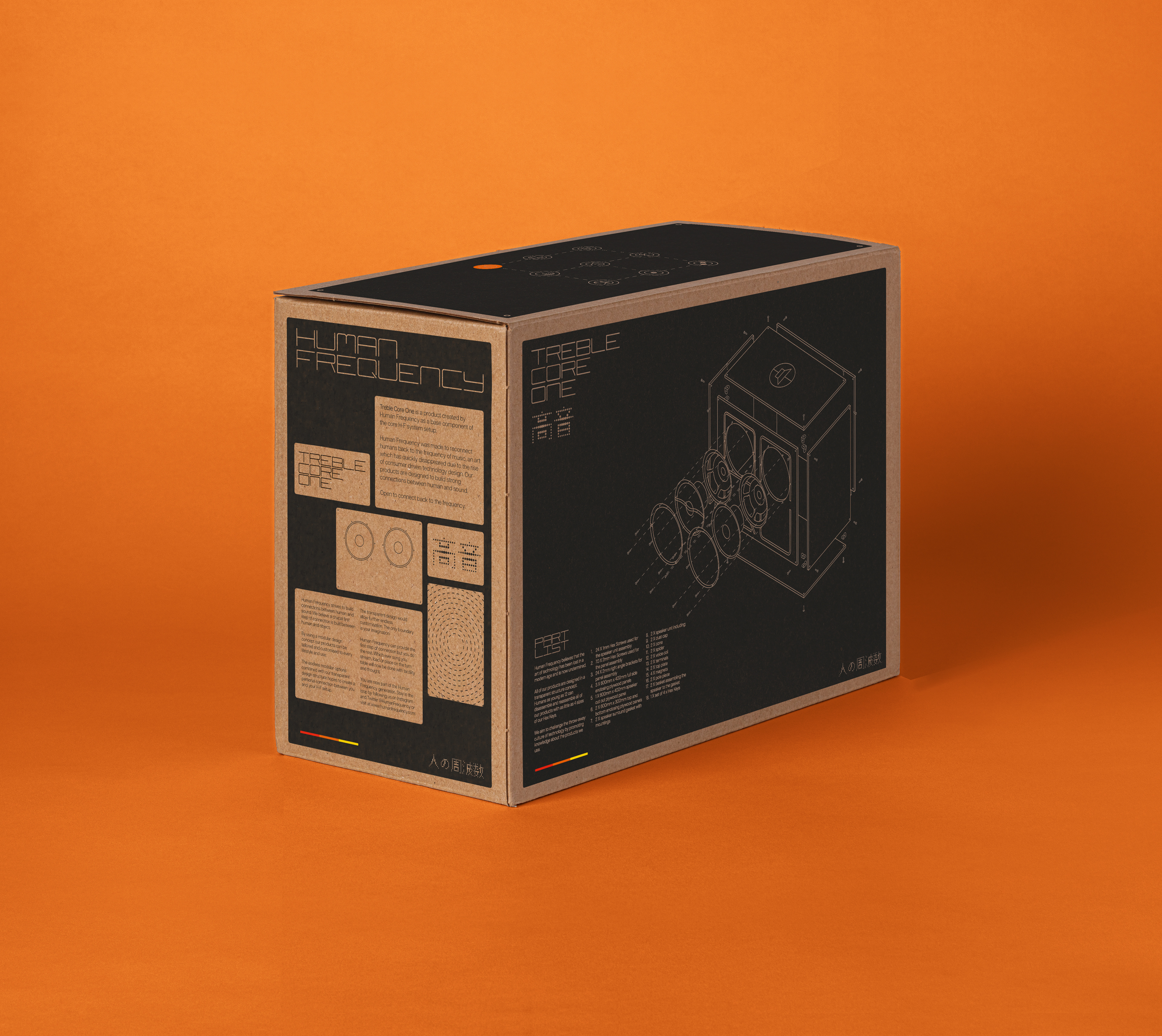
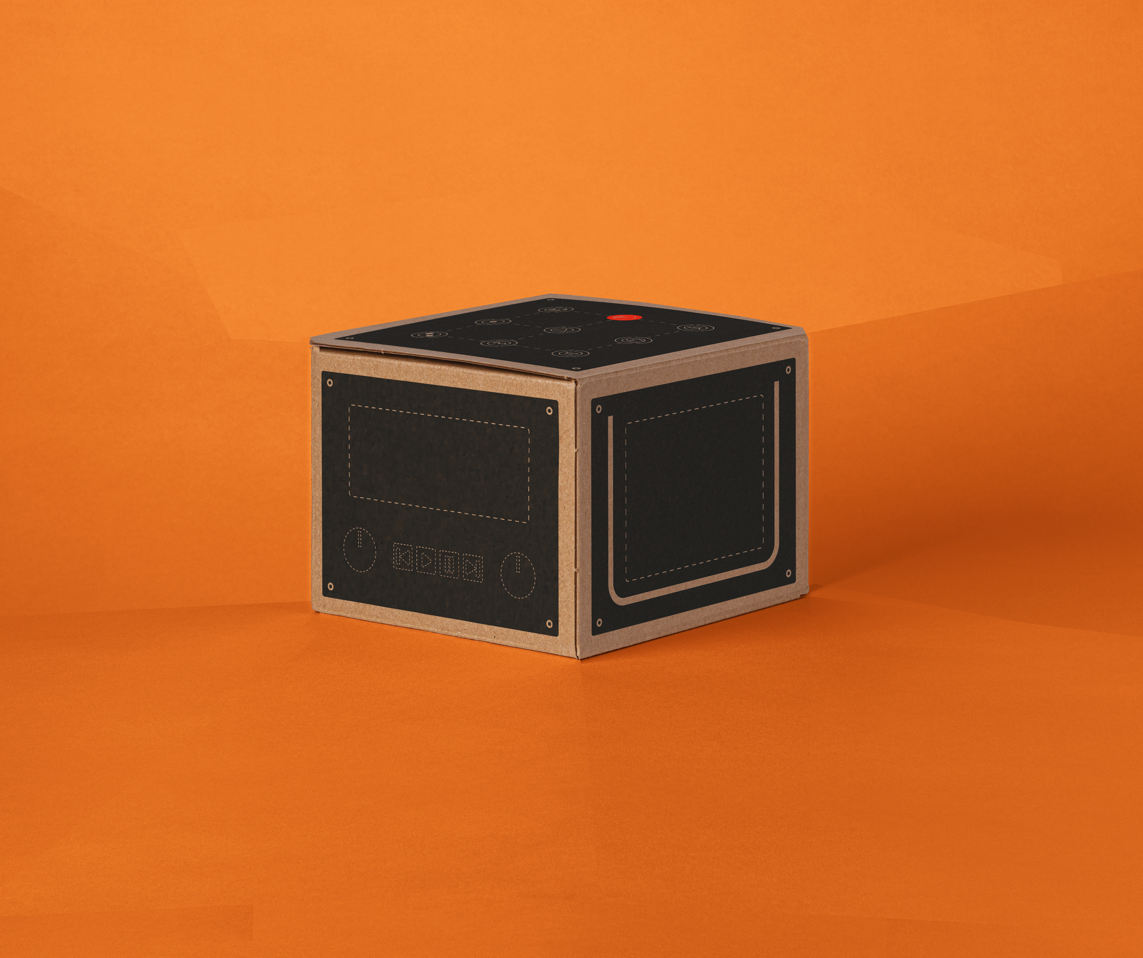
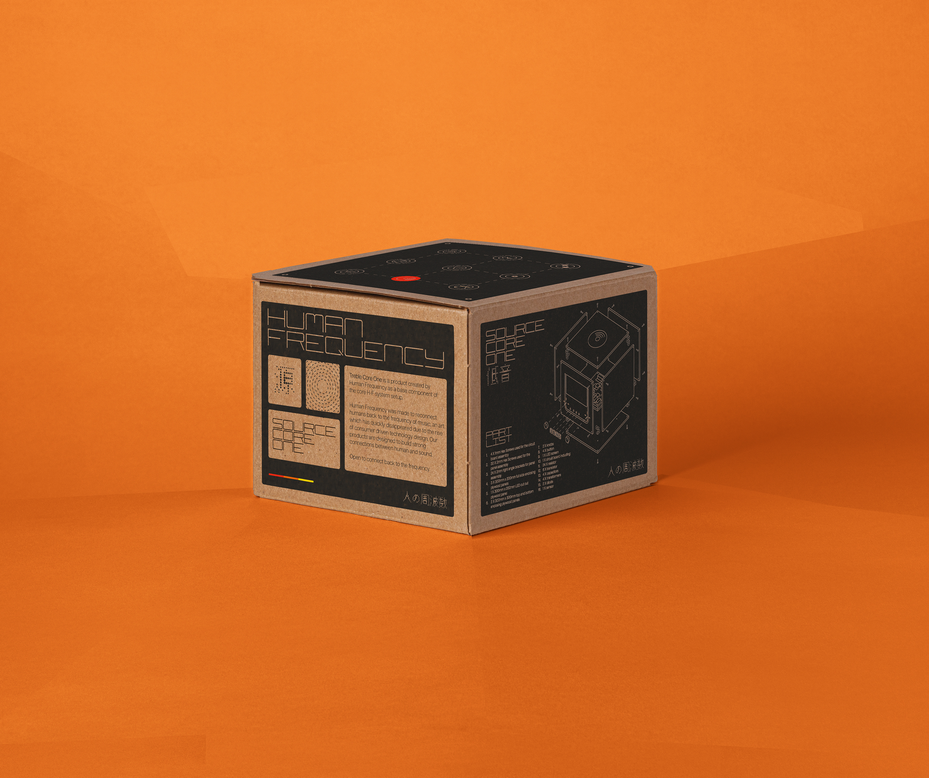
Similar to Hi-Fi stereo setups Human Frequency's products offer total modular customisation. There are units to suit everyone's listening wants and needs. The above shows three of the Core units needed to start the listening experience: Core Bass One, Core Treble One and Core Source One.
Other units manufactured by Human Frequency include: Amp Core One, Bluetooth Source, CD Source, Vinyl Source and Radio Source. Customisation remains an important aspect of Human Frequency, it strives off the ideology that the stronger person connection you have with your listening technology, the stronger your connection to the music.
The user manual is an essential component of Human Frequency, it both explains how our technology works, gives you space to be inspired, be creative and play. The stereo systems aren't intended to be placed on a shelf and forgotten about, much like the user manual which is designed to be in constant use. It also provides the user with four Hex Keys which are the only tools needed to take explore, modify and fix your products.
Below shows a series of experimental reels intended for the Human Frequency website. These all portray certain emotions encapsulated by Human Frequency.
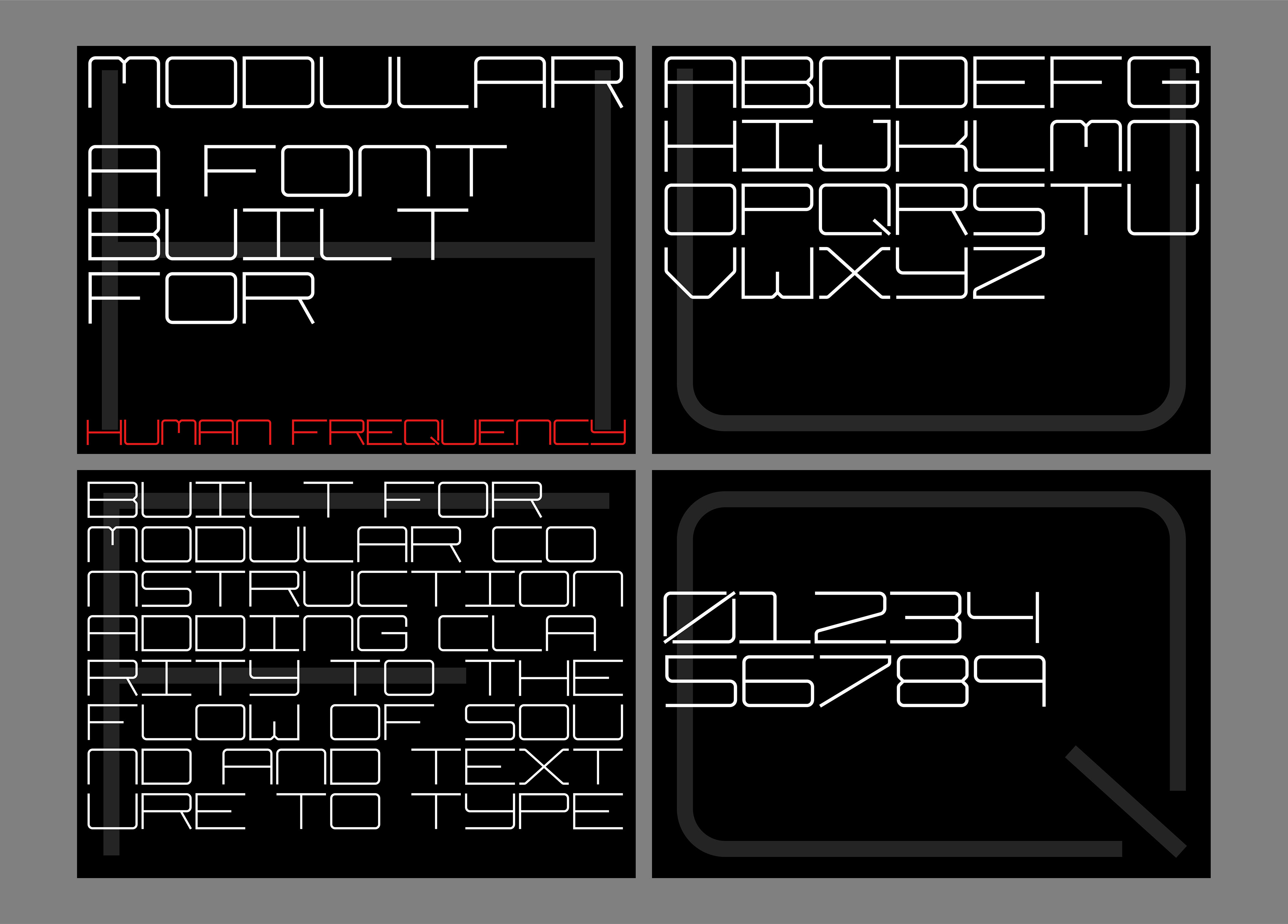
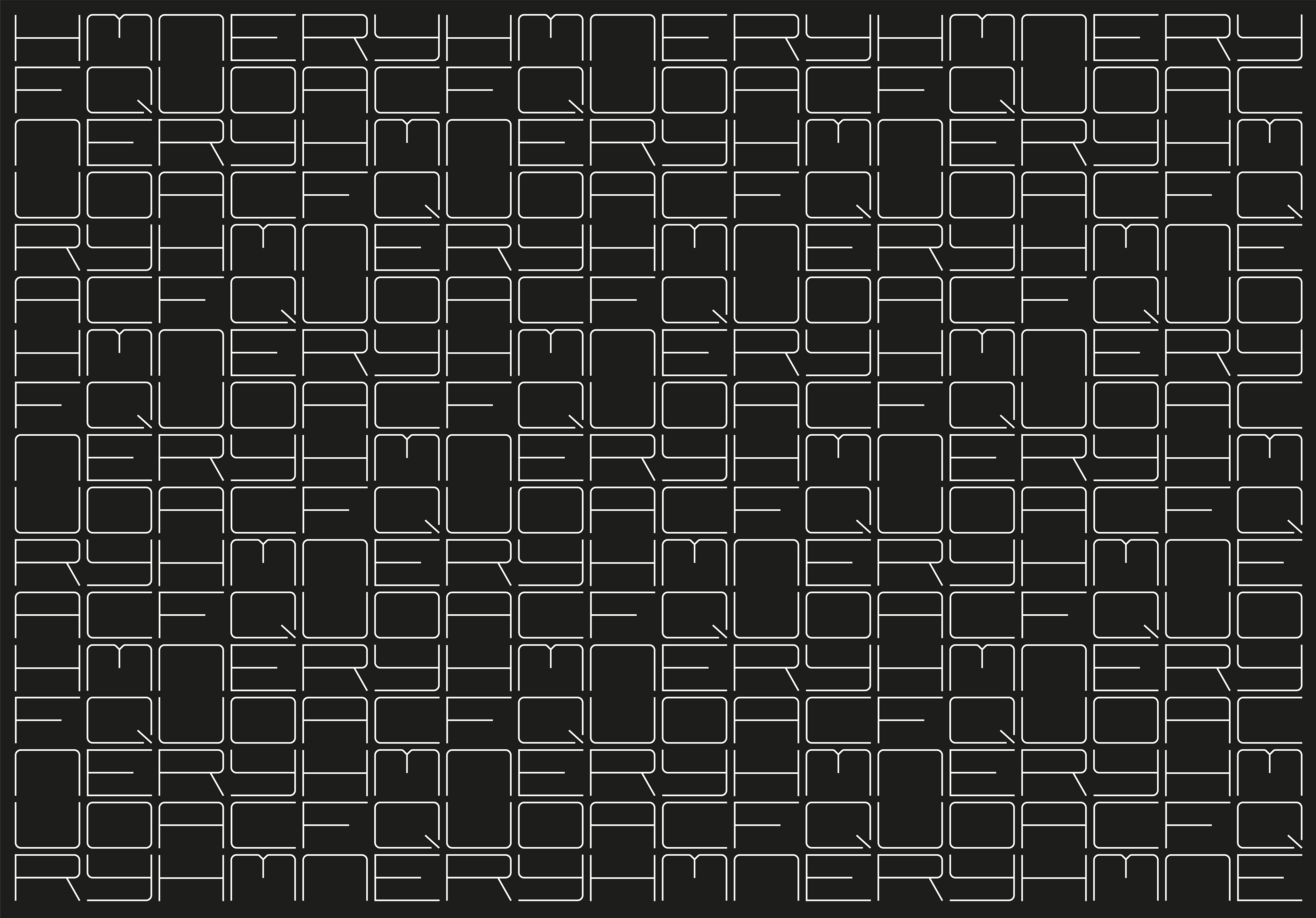
I designed the typeface "Modular" specifically for Human Frequency. I couldn't find any I was happy with which had enough structure so decided to design my own. This mono-type face uses half a character width for a space which allows double spacing to be used for total alignment. The characters are also representative of the modular components of the stereo system with the typeface being printed directly onto the units.
The isometric illustrations are key to showing a clear visual diagram of our units. These illustrations are included on the corresponding boxes and in the user manual, they are paired with the parts list which allows the user to have full understanding of their product.
