
As a designer I take inspiration from everywhere in the world. From impressive supergraphics displayed on London buildings to tiny rusted typography on metal plaques. Below is a log of design I have seen in the world, work I have collaborated on and everything in between.
Monday 14th June,
Collaboration,
Sigma Strength
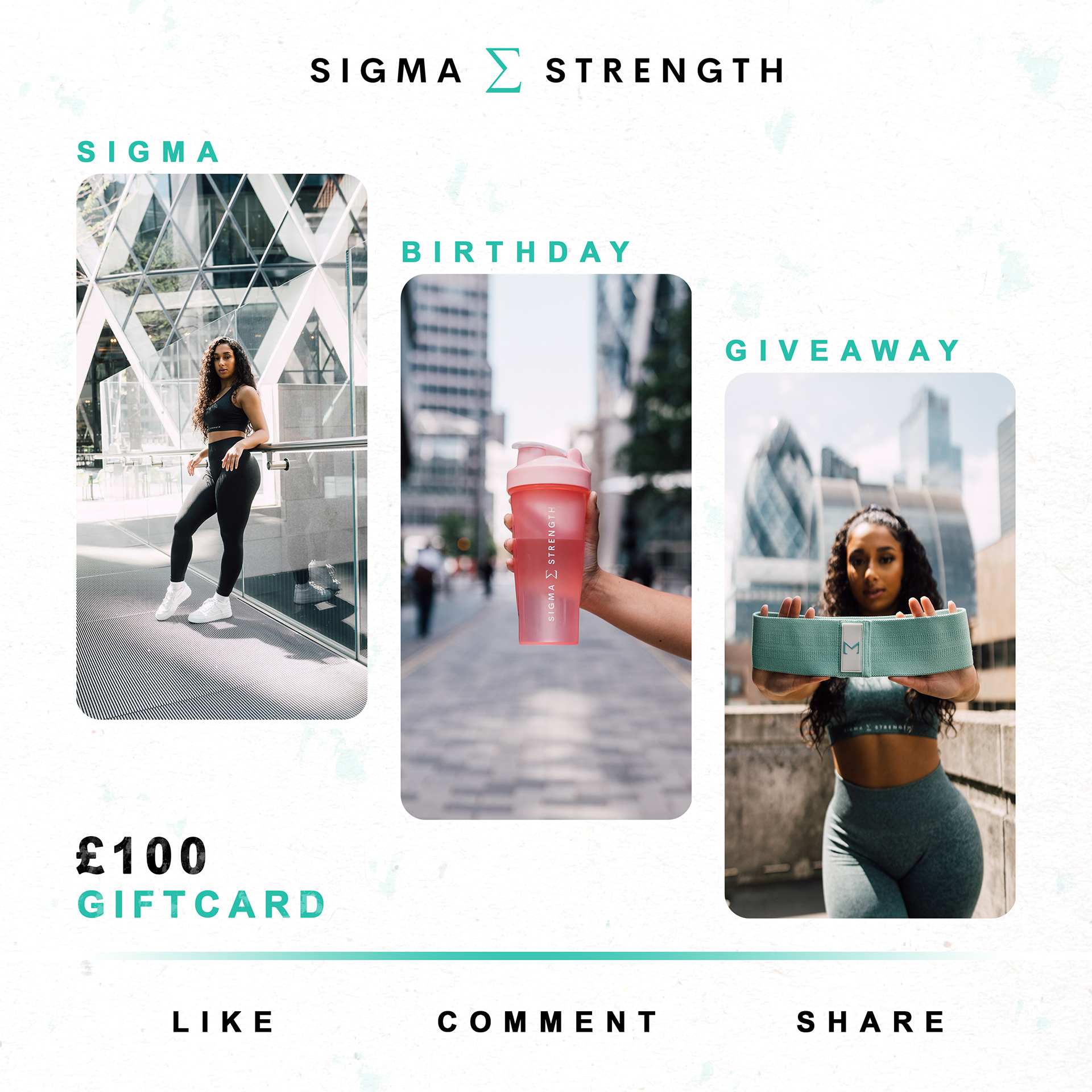
Alex Jones is a young entrepreneur who I know from my home of Cambridge. He started a gym wear company Sigma Strength for his Extended Project Qualification in sixth form and it kept growing. A year on he had more products coming out which he needed help advertising, he knew I was studying graphic design and reached out.
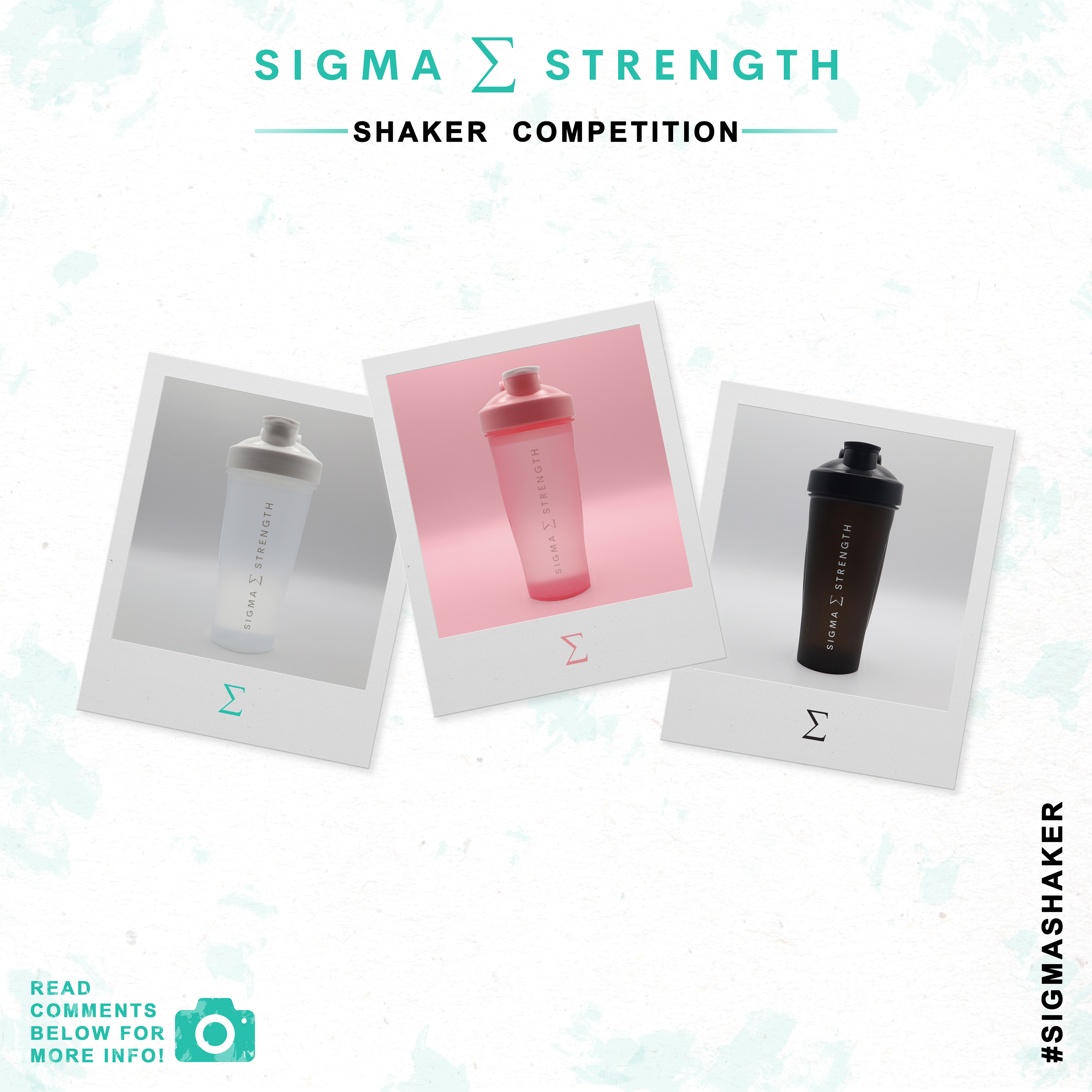
Firstly, we met in Cambridge with a selection of his new shaker bottles, because if you can successfully advertise a bottle which stands from the crowd you can pretty much advertise anything. This was the first time we had properly worked together; a test to see if this would work well between the two of us. We did work well together and collaborated on ideas on how to make the brand stand out on social media platforms and the general brand as well.
I began by playing with the logo, using different colour variations, making gifs. This one a fast paced one advertising the new colour variations of the bottles https://www.instagram.com/p/CQ6c5AVnCiG/
I continued to create posts for his Instagram page advertising competitions and other events for the brand. I developed some ideas for competitions to advertise the bottles more. This was my first experience of working with a business so closely, even though the business is new and smaller, but quickly upcoming, I still feel like it gave me a good idea of working with businesses.

Monday 2nd August,
Bigger Jobs,
Highfield’s Logo
I was approached by the head of Highfield’s Academy Ely, Adam, who needed a new logo for the upper sixth form for the special needs school in my hometown of Ely. This was a pretty big deal for me, will have been the biggest paid job so far in the beginning of my career.
I knew what steps to take to design it from my combined 3 years of studying graphics and I did just that. The upper sixth was called LINC 19-25. Adam didn’t mind if it was typographical or illustratively lead but wanted it to incorporate blue and present more mature than the main logo for the school. They’ve now incorporated it within their letter head for all their emails and letters which is pretty cool to see my designs put into use.

Greece
So I went to Greece, Skiathos to be exact, and I couldn’t just make a single post about this as there was that much inspiration from it. I would round up the design from Skiathos from the boat tour leaflets to the shop signs and bus tickets as sporadic. Sporadic in such a bad way it was good, in the same way David Carson rejects any laws and basic rules of graphic design, these Greeks only equipped with a version of PowerPoint from 2004 did it effortlessly.
I don’t want to seem like a twat that I’m simply laughing at the many businesses of Skiathos but I genuinely did find it inspiring and quite reminiscent. Every graphic designer knows that it would be sacrilege to use a Microsoft 3D font from an early version of PowerPoint and imagine how their career would be wiped off the face of the earth if they used it for a clients brief, but these business owners had no knowledge of these rules that a graphic designer subconsciously has. This resulted in some awfully beatifically constructed designs.
Friday 27th August,
Inspiration,
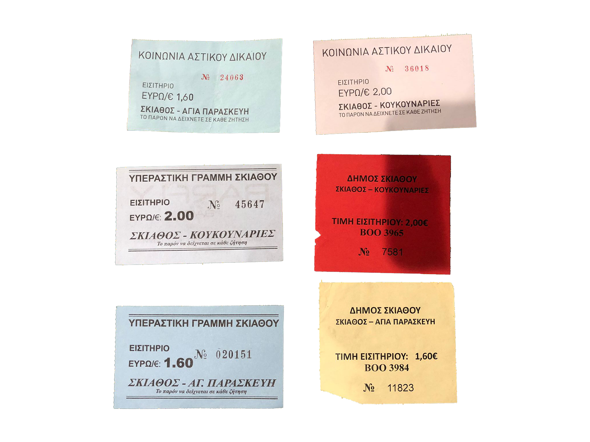
The Typography of a Bus Ticket
Right, I’m just going to start off by saying that if you get carsick, prefer any sort of safety protocols, seat belts, don’t like dancing on the edge of death every time you want to get in a vehicle; don’t go to Skiathos. Now I can’t speak for the rest of Greece, every taxi and bus driver may not be an ex Redbull performance stunt team driver like Skiathos but Christ did it feel like that. So there was one bus route on the island, from Skiathos dock all the way along the coast to Koukounaries Beach, which was the side I was at, the bus comes every half an hour and you want to know which stop you’re getting off at because an old angry Greek man just isn’t ideal when you neither can speak Greek or are on a full bus with everyone staring at you. Ticket people in Skiathos work a bit differently from the UK too, these ones walk up and down the bus whilst the driver is twisting around the sharp corners looking over the Greek cliffs.
The first time we got the bus into town was Friday; we wanted to explore and hit the town. I received a light blue coloured ticket ripped off a stack from the hand of the ticket man. Immediately it was inspiring, the upper and lower borders cut off before they reached the edge, mixed with the varying fonts, sizes of fonts, opacity due to the worn-down printer was perfect, it almost transported you back to ancient Greek times. There are three fonts used on these tickets, a standard Helvetica for the bulk of the text, some of which was in bold. Then beneath this a serif font which the unique Greek alphabet took and brought it to a new unique beauty, all in italics too; not for any real reason I could discover. Then the third font, used for the number of your ticket. This was a good used of the font, the most unique part of the ticket, your number, used the most unique font. The magic of this was the un-intentionality of the beauty of the bus ticket, no one designed this bus ticket to captivate the imaginations of the riders and transport them back to ancient Greece, nor was it designed to appear in a students blog about his graphical inspiration. It was completely unintentionally beautiful.
TBC